What's new in Swift Release 24 in October?
Swift Release 24 – October features the following capabilities:
We are thrilled to present the latest release notes for Oct 2024. Swift now has even better features for easier use and smoother operations.
Read on to discover the highlights of this release and unlock new possibilities for your app development journey.
Make “Password Reset” Email Template
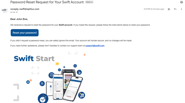
With this release, business analysts and admins can now easily customize the “Forgot Password” email feature. Users can personalize email templates directly from the user interface (UI), making it simple to align with specific business needs.
Key highlights of this feature include:
- Customization Options: Tailor the “forgot password” email to reflect your company’s branding and requirements.
- Rich Text Editor: Use the new rich text editor for easy formatting changes, ensuring your email looks professional and consistent with your brand.
- Curly Braces for Reset Button: Simply add the reset password text within curly braces to ensure the reset button works correctly when the email is sent.
- Custom Subject Lines: Choose a subject line that suits your communication style instead of the standard “password reset” message.
This improvement makes it easier for users and helps businesses keep a consistent brand identity in their communications. Plus, it gives them flexibility.
How to Use this feature:
- Go to the app where you want to customize the email template.
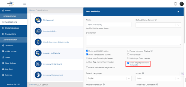
- Edit the app by using a pencil icon and find and select “Show Forget Password.”
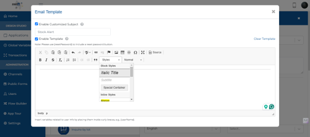
- Click on the “Template” option to customize the email template. This will open a window with a rich text editor.
4. Customize the Email Template:
- Click on “Enable Customized Subject” to make your subject line.
- Click “Enable Template” to customize the email. A rich text editor will open.
- Format the email as needed.
- Include the reset password text in curly braces (e.g., {reset password}) for the functional button.
- After customizing, save your changes.
- Check the “Forgot Password” feature to ensure the email is sent correctly and the reset link/button works.
Filter Media Object (MO) By Structure
With this release, designers can now control which JD Edwards media objects are displayed to end users in the GridView Component by suppressing them based on their MO Structure. This enhancement helps ensure that users only see relevant media, reducing clutter and making information clearer. To use this feature effectively, some settings may need to be adjusted.
These features improve the usability and functionality of JD Edwards MO by providing a customized filtration.
How to Use this feature:
- Navigate to the relevant grid view component from your view action form.
- Click on the edit pencil icon to open the configuration.
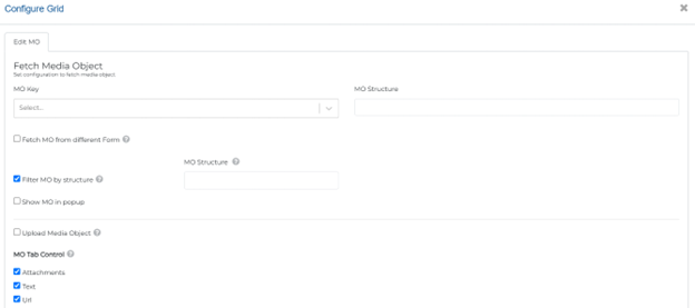
- Click on the Configure Grid link, and open the “Edit MO” tab.
- Enable ”Filter MO by Structure” and add the relevant JDE structure.
- Once configured, the MO on the end user app will be filtered out based on the given MO structure.
Google Maps Upgrade
With this release, designers can now use the updated Google Map feature. It includes live location tracking and the option to add markers. Users can set both starting and ending locations, making navigation easier.
Key highlights of this feature include:
- Current Location Option: Users can easily use their current location, which connects with Google Maps using a provided API key.
- Start and End Locations: Designers can dynamically map form fields to get both start and end locations using latitude and longitude or the current location feature, enabling flexible routing.
- Route Display: The map shows routes between the chosen start and end points, helping users navigate visually.
- Zoom Level Adjustment: Designers can change the map’s zoom level for a closer or wider view of the area.
- User Interface Enhancements: The updated control allows for a simple drag-and-drop setup, making it user-friendly for designers.
These enhancements greatly improve the user experience by providing real-time tracking and more interactive map features, making navigation more engaging and efficient.
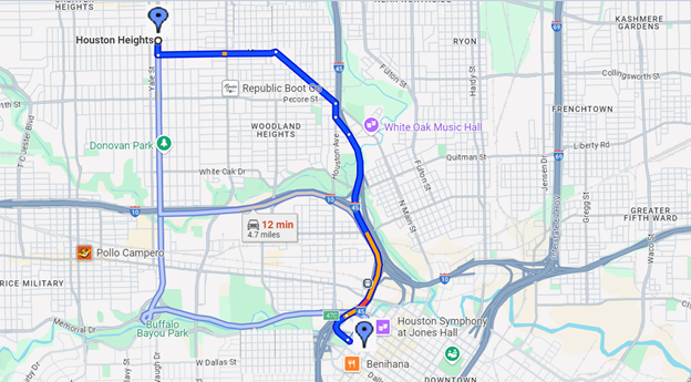
How to Use this feature:
- Get a valid Google Map API key and add it to your application settings.
- In the map control settings, enable “Start and End Location” to specify a starting point and a destination. Map dynamic form fields to make your map dynamic.
- To use the user’s current location as the starting point, check “Use My Current Location” to automatically fetch the user’s GPS coordinates.
- For custom locations, drag and drop text input controls for latitude and longitude. Enter the desired coordinates in these fields.
- Once the start and end locations are set, the map will display the route between them. Adjust the zoom level for desired visibility.
- Add markers for both the start and end locations by specifying their coordinates in the map control settings.
- Implement live location tracking by periodically updating the user’s position on the map using a timer or event listener.
- After setup, test the map functionality to ensure locations, routes, and live tracking work correctly.

Multilingual Support Now in Chinese
With this release, the designer can now offer multilingual support in the Final Boss Form (FBF), including Chinese language options. This update allows Chinese-speaking users to navigate the app in their native language, enhancing accessibility.
This enhancement aims to improve user experience and broaden the application’s usability for different language speakers.
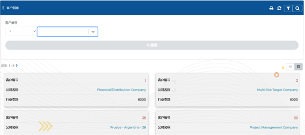
How to Use this feature:
- Access language settings in your application by clicking on the edit pencil icon.
- Add the Chinese language from the available options.
- Create language keys for text elements (e.g., buttons, labels).
- Provide translations for each key (e.g., “Submit” and its Chinese equivalent).
- Assign language keys to the corresponding UI elements.
- Test by switching the application to Chinese and check translations.
- Ensure dynamic language switching is supported for real-time updates.
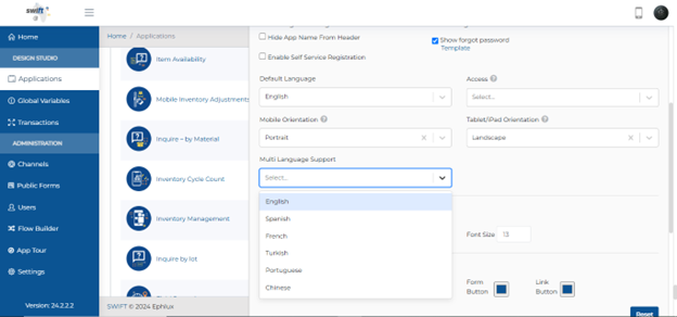
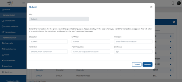
Conditional Form Rendering
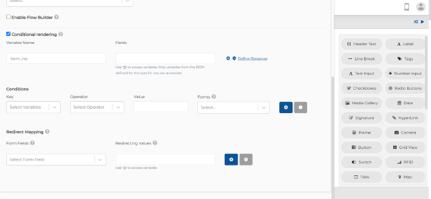
With this release, we introduced an option for conditional rendering when data is selected or changed in the tag control. This feature allows for dynamic UI adjustments based on user input.
When a user selects a value from the tag control, conditions can be set to decide which fields or forms will be displayed next. For example, if a specific value is chosen, the system can show additional fields or redirect to another form.
This enhancement offers greater flexibility in form design, creating a tailored user experience that responds interactively to selections made in the tag control.
How to Use this feature:
- To get started, drag and drop a tag control onto your form. This control will hold the static values you’ll use for conditional rendering.
- Configure the Tag Control:
- Click on the tag control to open its settings.
- Define the static values (e.g., Male, Female) that will be used for selection.
- Enable Conditional Rendering:
- In the settings of the tag control, look for the option to enable conditional rendering.
- Specify the conditions under which other components will be displayed or hidden based on the selected value in the tag control.
- Create variables that will be used in your conditions. For example, you might use variables like name for the first name and unit for the business unit.
- Set Conditions:
- Specify the conditions that will trigger the rendering. For instance, if name (the first name) equals “Mike” and unit(the business unit) equals “Sales,” you can set the condition to render a specific form or control.
- You can add multiple conditions as needed.
- If you want to redirect values based on the conditions, link the tag control to other input fields or forms. For example, if the conditions are met, the values from the tag control can be passed to another form.
- After setting up the conditions, test the form by selecting different values in the tag control to ensure that the conditional rendering behaves as expected.
Trigger Actions Automatically
With this release, designers can now automate actions based on specific conditions in component configurations.
Previously, actions required manual clicks after data entry. Now, when data is updated, the trigger service can automatically execute an action after a set delay.
To configure this, users specify conditions that must be met for the trigger to activate. For example, if certain criteria are met—like matching specific field values—the system automatically sends data to the relevant database or channel, enhancing efficiency and reducing manual submissions.
Overall, this feature improves the responsiveness of applications by enabling dynamic interactions based on user actions.
How to Use this feature:
- Open the entry form and select the specific component (e.g., text input field, tag, buttons etc) to configure.
- In settings, find and enable “Trigger Service on Update” for all other components e.g (e.g., text input field, tag). For the button “Enable Auto Trigger” will be available.
- Define conditions for activation (e.g., “if Item Number equals 23 and Name equals ‘Nick'”).
- Specify the action that occurs when conditions are met (e.g., sending data to a database or channel).
- Add a delay in milliseconds for service execution after conditions are met.
- Enter values to check if conditions trigger the service automatically.
- Once tested, publish the changes to make them live.

Conditional Required Attribute
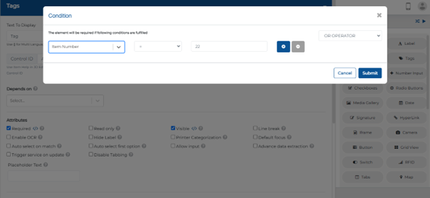
With this release, designers can now implement a “Conditional Required” attribute for all relevant controls. This feature allows specific fields to be marked as required based on certain conditions.
For example, if a user enters a particular value in a designated field, another field can be dynamically set to required, ensuring that users provide necessary information before proceeding.
How to Use this feature:
- Open the entry/viewaction form and choose the control (e.g., text input) for the conditional required attribute.
- Go to the settings of the selected control.
- Find and check the option to set the control as required.
- Specify the condition for when the control will be required (e.g., if “Item Number” equals 22).
- Enter values to check if the condition works—if met, the control should indicate it’s required.
- Save your changes after configuring the required attribute.
This functionality enhances form validation and improves user experience by ensuring that only relevant fields are mandatory based on user input.
Instant Actions on Find & Browse Form
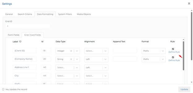
With this release, designers can enhance the Find & Browse form Grid by displaying action buttons directly within the grid view.
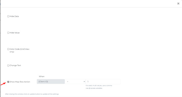
Designers can set rules to show these buttons based on specific criteria, such as only displaying an “Approve” button when the status of available orders data is “Ready to Approve”. By ensuring that users only see pertinent options, this update improves overall efficiency and usability.
This streamlines the user experience, allowing users to see and access relevant actions without extra clicks.

How to Use this feature:
- To add an action button to a grid view, go to the settings of that specific grid view.
- Define the Rule:
- Go to the Data Formatting section within the grid settings.
- Select Define Rule to create a new rule for displaying the action button.
- Set Conditions:
- Enable “Show Map Row Action” and Specify the conditions under which the action button should be displayed.
- You might want the button to appear only for certain records that suit your needs.
- Save your changes to apply the new settings after configuring the button.
- Navigate to the grid view and verify that the action button appears only for records that meet the defined conditions.
Button Component Conditional Visibility
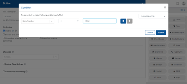
With this release, Designers can now disable buttons based on specific conditions, enhancing control over user interactions in forms. For example, a button can be set to appear only when:
- Address number = 100
- Alpha name = “Nick”
If these criteria aren’t met, the button remains hidden from the user.
This enhancement improves user experience by:
- Preventing unnecessary actions
- Guiding users to provide required information
Dynamically showing or hiding buttons based on conditions streamlines workflows and ensures users see only relevant options.
How to Use this feature:
- Navigate to the entry form where the button is located.
- Click on the button to open its settings.
- In the button settings, find the Visible option.
- Specify the criteria for when the button should be visible or hidden.
- Define the Condition: For example, you might set a condition such as:
- If item number equals 100 and alpha name equals Mike, then the button should be visible.
- If these conditions are not met, the button will be hidden.
- Save the settings to apply the changes.
- Enter values in the relevant fields (e.g., address number and alpha name).
- Check if the button appears or disappears based on the conditions you set.
Wrapping Up
Swift’s latest updates collectively empower users to navigate their app environments with greater ease and efficiency.
Remember, customizing your tools leads to a smoother and more efficient workflow!
Thank you for being a part of the Swift community. Here’s to optimizing your processes and achieving success!
With 💙 from Swift
Your feedback is essential in driving us forward, so please don’t hesitate to share your thoughts with us; and stay tuned for more groundbreaking features as we evolve!
The ability to create “disposable” experimental processes and apps opens up the untapped potential of the enterprise to address business problems with an unprecedented agility and positive innovation energy.
How Swift provides the game-changing capability?
Most low-code, no-code platforms evolved as the next-phase of the original development tools, built a decade or two ago, and still follow the same development mindset in their DNA. Although they’ve tried their best to make them easy for the business analysts and the users, majority have fallen short.
To bring about the real paradigm shift and benefits of a low-code/no-code platform, a grounds-up rethinking was required to work at a meta-data level, and incorporate at the core of the architecture, the latest and greatest advancements in web and mobile technologies, integration, security, analytics and cloud-based server frameworks.
Get started with Swift
Get Started with Swift
Sign up for Swift Start and get a fully functional Swift instance, pre-integrated with a JD Edwards demo instance. You can explore the pre-built apps available on Swift App Store, customize them or create your own from scratch and share them with your peers.
Join Swift Online Training
Join us for the Online Training and learn to design, build, deploy and launch mobile and web apps in a matter of minutes, and how they are automatically integrated with JDE applications, orchestrations and databases without the need to write a single line of code.
Get Swift Certification
Swift Certified Consultants are responsible for designing, developing, launching, extending and managing Swift applications. Join some of the most innovative and reputed JDE professionals in the industry by getting your Swift functional or admin certifications.
